
Good design gets noticed. Great design gets felt. In games, colour and light don’t just make things pretty — they steer attention, shape emotion, and quietly tell players what matters next. This power of visual design extends beyond the game itself; gaming advertising also borrows these same tricks to catch attention and go viral before the player ever opens the app. Lost in a busy HUD? A warm rim light can pull your eye. Confused in a level? A bright colour cue can say “go here” without a single word.
The underlying science is straightforward
Human vision is wired to pick out contrast and novelty first. Brightness differences, saturated hues, and sharp edges are visual magnets. Designers exploit that: boost contrast around interactive elements, use complementary colours to separate foreground from background, and keep important objects the most saturated things on screen. But there’s nuance. Too much saturation screams; too little blends into gray noise. It’s about balance, not brute force.
Lighting: The Complementary Element
Dynamic lighting creates depth and drama. A narrow shaft of light over a chest makes it irresistible. Soft ambient light sets mood; hard directional light sculpts form. Game engines give us tools — global illumination, bloom, ambient occlusion — to craft believable scenes. Yet the goal often isn’t realism alone; it’s clarity. Subtle bounce light can reveal a path. A vignette can focus attention at the centre of the screen. Lighting gives the eye a map.
Colour carries cultural baggage and immediate emotional shorthand. Reds can suggest danger or urgency; blues often feel calm or trustworthy. But don’t treat colour as a universal law; context matters. A red button labelled “accept” in one interface might read as “danger” in another. Testing with real players is the litmus test. Designers who iterate quickly catch unintended meanings before they harden into user frustration.
Tools, too, affect design choices
UI elements on mobile must be legible under sunlight; console HUDs need to sit harmoniously over cinematic scenes. Designers use contrast ratios, colour-blind palettes, and adaptive lighting to widen accessibility. That’s not optional anymore: good design must be inclusive. Practical tricks help: use both hue and luminance to code information; add shape or icon redundancy for colour-blind players; animate subtle motion to draw peripheral attention without shouting.
There’s an art to the small gestures
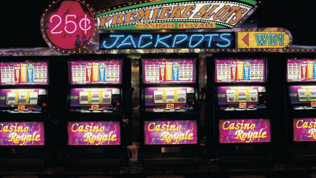
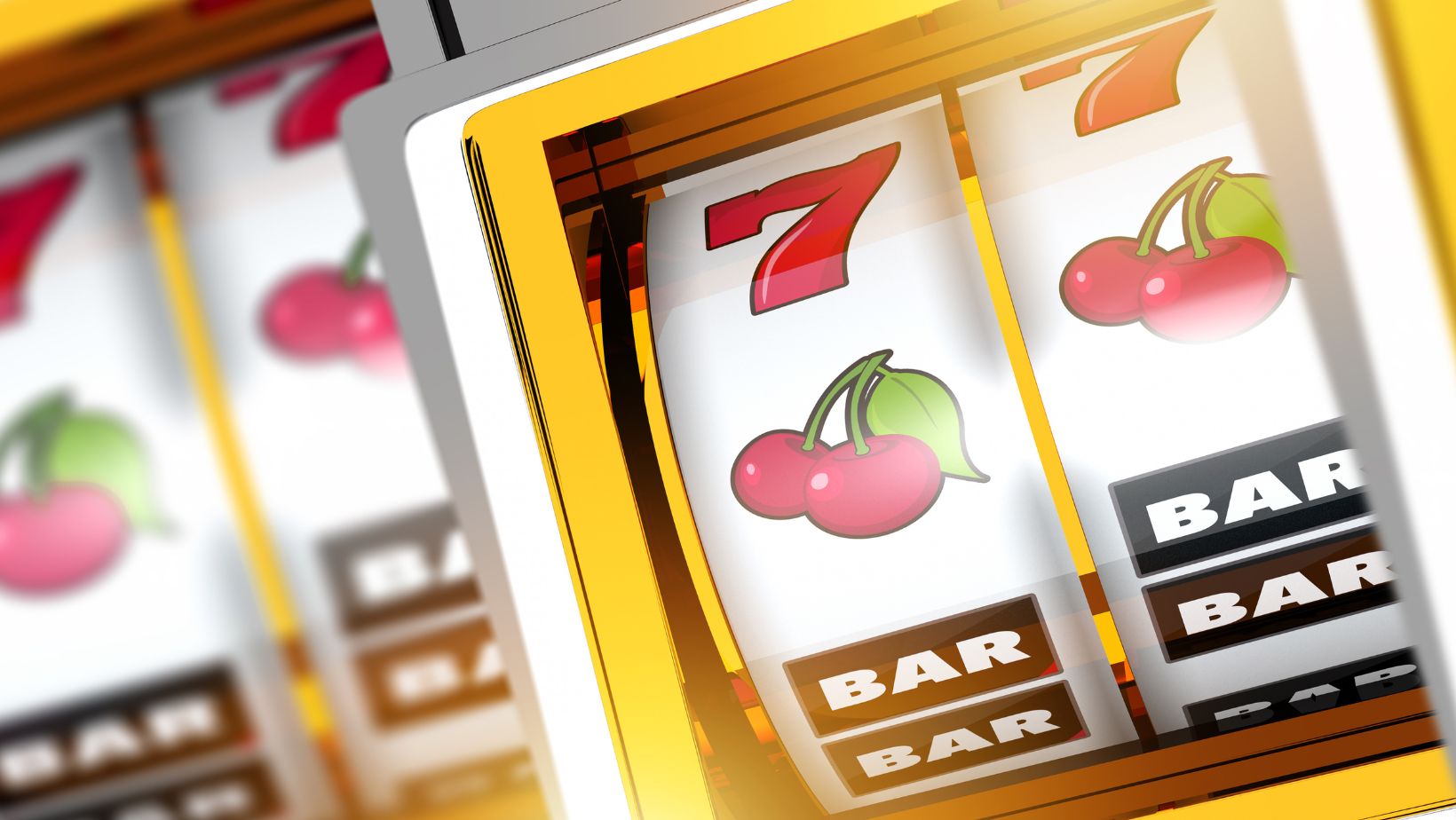
A soft glow around a selectable object, or a tiny particle sparkle when you hover, feels like delight because it acknowledges the player’s action. These micro-interactions are emotional seasoning. They reward, reassure, and make the interface feel alive. The visual aesthetics of slot game interfaces, for instance, combine psychology and art to guide emotion and enhance the player journey — and the same principles translate across genres.
So where should you begin if you’re designing for attention? Start with hierarchy. Decide what the player must see first, second, and third. Then strip away competing signals until the path is clear. Use colour and light to reinforce that order. Iterate with playtests, and be ruthless about removing pretty-but-distracting elements.
Takeaways
Delight comes from clarity and surprise working together. Colour and light guide the eye, cue emotion, and create moments that feel earned. When done well, design becomes invisible in the best way — the player simply knows what to do and feels good doing it.
Gaming advertising also uses design to go viral, borrowing these same tricks to catch attention before the player ever opens the app.
Tell me: which recent game hooked you with a single brilliant visual moment? Leave a comment and let’s compare notes.
More Stories
The Perfect Blend of Precision, Performance, and Personality: Choosing Your Ideal Gaming Keyboard
How Online Casinos and Betting Platforms Stay Creative Without Reinventing Everything
How Streamers Sync Casino Gameplay With Live Chat